English

👩🏽‍💻 my role

UX Researcher

UX & UI Designer

👩‍👩‍👦‍👦 team

me and Developer (Krzychu)

me and

Developer (Krzychu)

me and

Developer (Krzychu)

⏰ time

2 months

🏷 tags

convert text, web application

convert text,

web application

convert text,

web application

so, what's the problem?

While sipping coffee on my balcony and wondering,
what the hell I would do during freelance, I got a message…

"Hey! I promised to text you about my idea.
Hope you have some free time soon?"

"Hey! I promised to text you about my idea. Hope you have some free time soon?"

Krzysztof was annoyed every time he had to format text for developing a website. Things like converting spaces to lines or changing lowercase letters to uppercase.

With the existing tools, he couldn't 💔


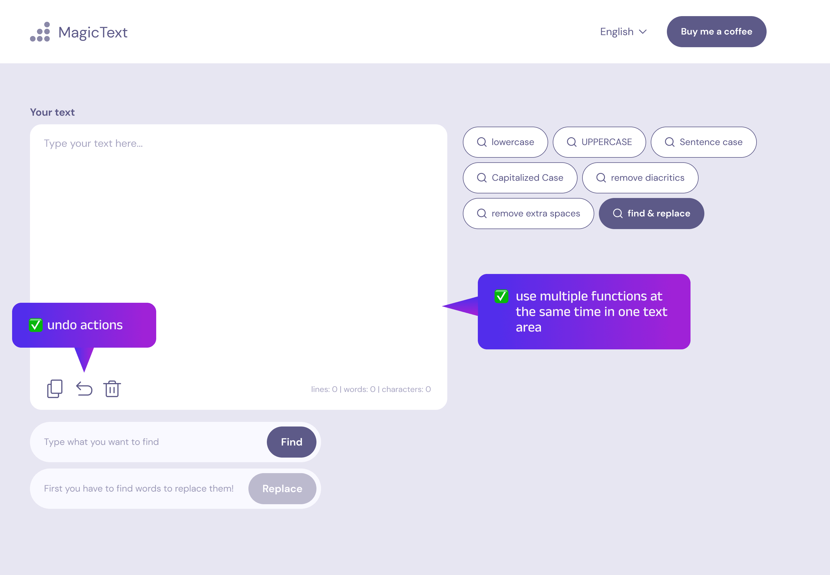
  • undo actions 😱

  • use multiple functions at the same time,
    and had to copy text into separate tools with desired functions.

  • replace or remove special characters from the text.

With the existing tools, he couldn't 💔


  • undo actions 😱

  • use multiple functions at the same time,
    and had to copy text into separate tools with desired functions.

  • replace or remove special characters from the text.

With the existing tools, he couldn't 💔


  • undo actions 😱

  • use multiple functions at the same time, and had to copy text into separate tools with desired functions.

  • replace or remove special characters from the text.

With the existing tools, he couldn't 💔


  • undo actions 😱

  • use multiple functions at the same time,
    and had to copy text into separate tools with desired functions.

  • replace or remove special characters from the text.

So, he came up with a simple tool to make the job easier for himself and his IT friends. I had the opportunity to design this solution to be both user-friendly and visually appealing.
let's do Discovery!

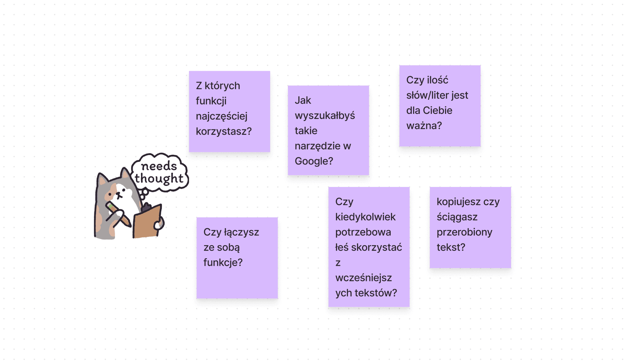
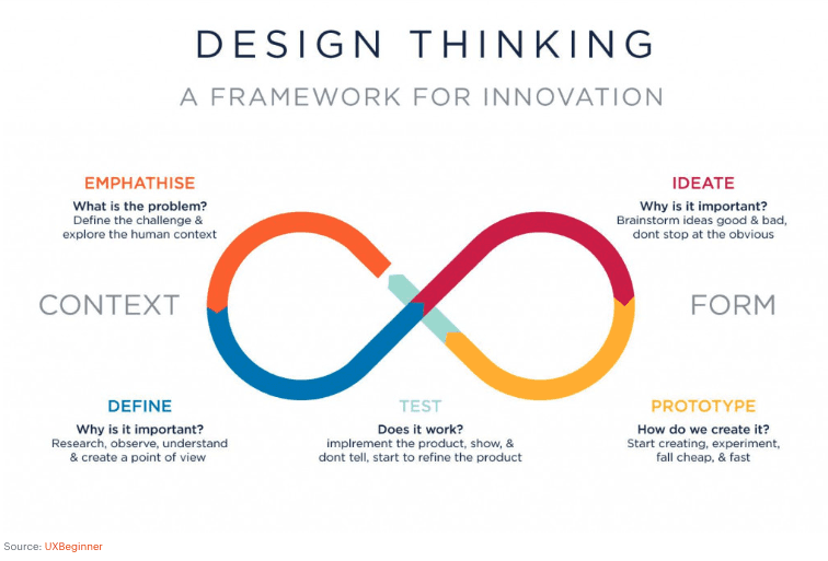
As an analyst freak, I wanted to follow best UX practices to ensure we didn't overlook anything. I outlined our actions using the Design Thinking process and conducted some research.

First, I interviewed Krzychu 💬

and make sure he included everything important in the project brief.
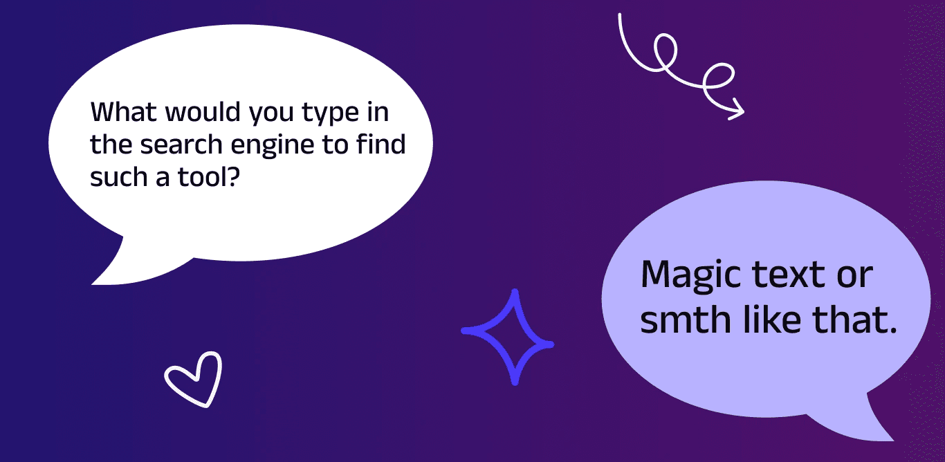
Beside a cool name for our solution and confirming MVP elements, we planned features for the next iterations:

  • saving user history via cookies,

  • download converted text as a document,

  • italicize, bold, underline text,

  • lorem ipsum generator,

  • …and so much more!

Then, a few similar tools came into my hands 👩🏽‍💻

…and in one or two we really liked
the use of icons and the color schemes.
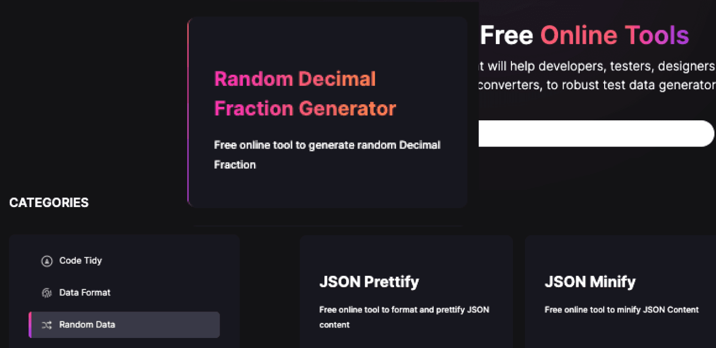
Some of them had a little bit old-school UI… but inspiring patterns!
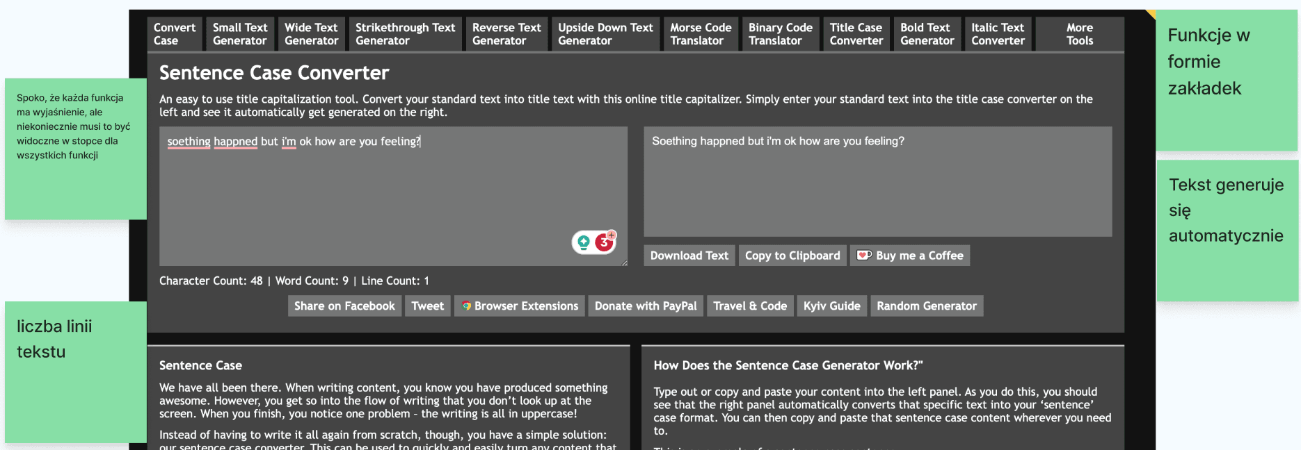
As a designer, I decided to borrow ✅


  • dark color & cosmic gradient,

  • "clear" button in text area,

  • icons with feature titles.

As a designer, I decided to borrow ✅


  • dark color & cosmic gradient,

  • "clear" button in text area,

  • icons with feature titles.

And not to follow ❌


  • lack of ability to undo action,

  • no validation, when text area is empty,

  • small spaces between elements that are groups

    (sad gestalt 😢)

And not to follow ❌


  • lack of ability to undo action,

  • no validation, when text area is empty,

  • small spaces between elements that are groups (sad gestalt 😢)

And not to follow ❌


  • lack of ability to undo action,

  • no validation, when text area is empty,

  • small spaces between elements that are groups

    (sad gestalt 😢)

research insights matter

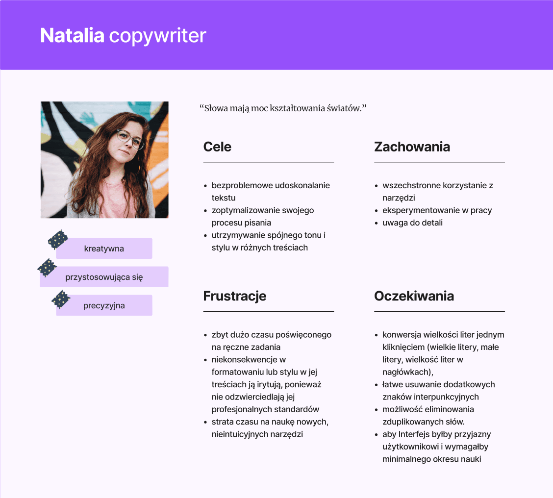
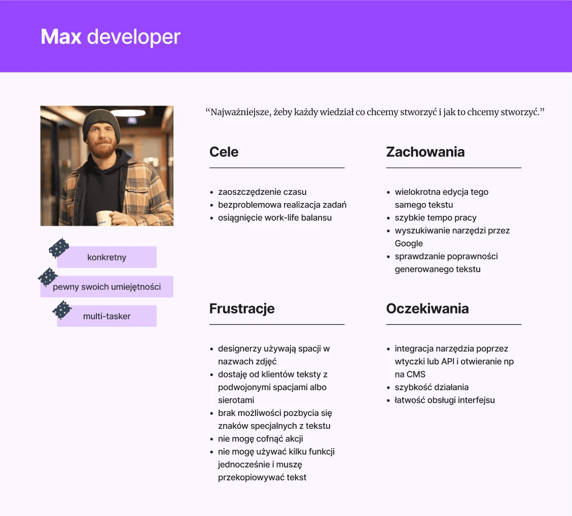
I translated my findings from the discovery phase into project scope and personas
(as a UX I couldn't skip personas, even for such easy tool 🙈).

We discussed this with Krzychu and defined the final MVP scope.

I translated my findings from the discovery phase into project scope and personas (as a UX I couldn't skip personas, even for such easy tool 🙈).

We discussed this with Krzychu and defined the final MVP scope.

I translated my findings from the discovery phase into project scope and personas (as a UX I couldn't skip personas, even for such easy tool 🙈).

We discussed this with Krzychu and defined the final MVP scope.

Rome wasn't built in a day ☝🏽

As you can see in the above image,
I got rid of two of Krzychu's pain points in the first sketch!

As you can see in the above image, I got rid of two of Krzychu's pain points in the first sketch!

Yeah, two pain points were gone, but another problem occur 🥶
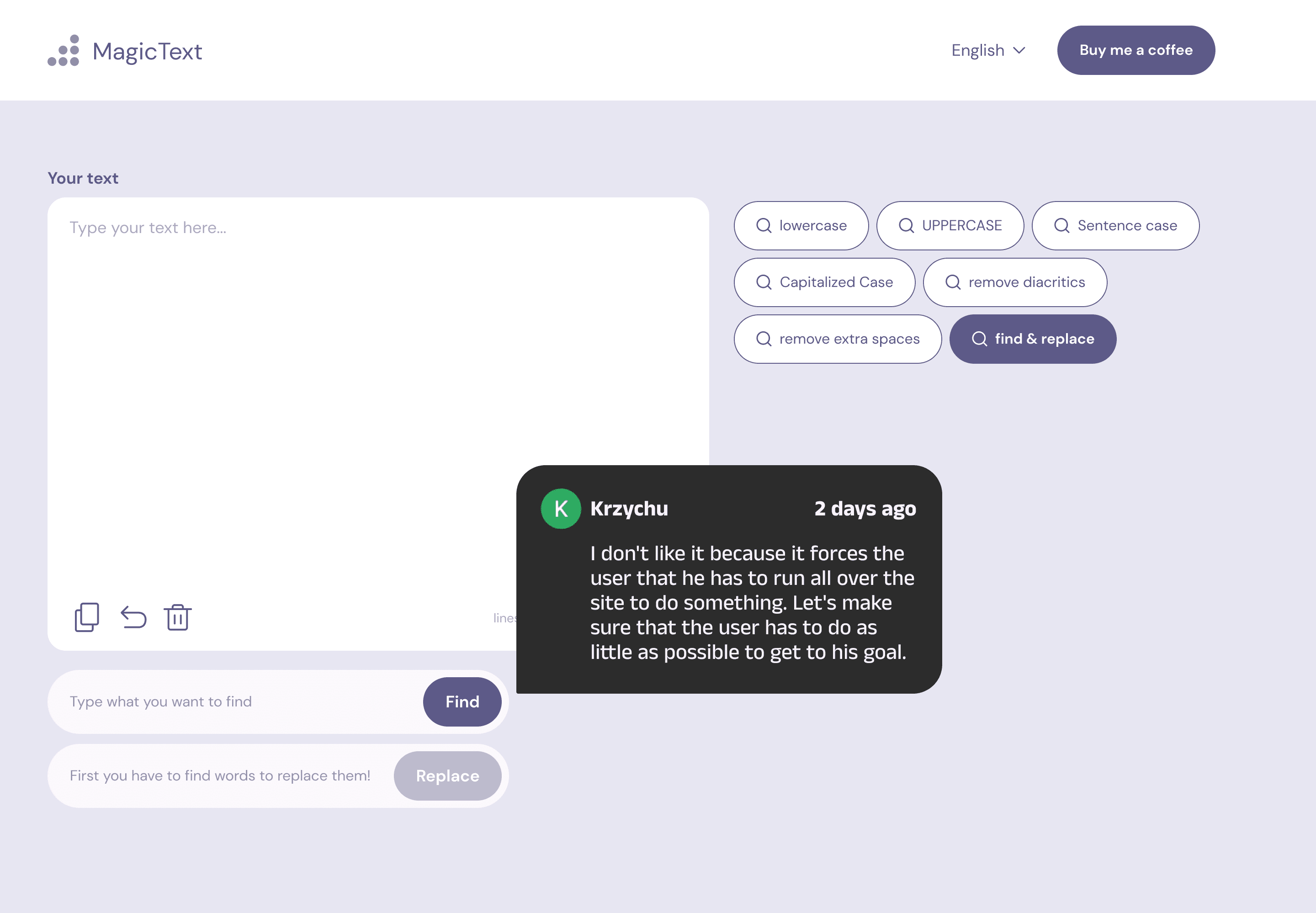
Krzysztof as a super-skilled and experienced front-end developer, supported me
with his creative mind, and we came up with a nice, smooth solution for this feature 🤓

Krzysztof as a super-skilled and experienced front-end developer, supported me with his creative mind, and we came up with a nice, smooth solution for this feature 🤓

Krzysztof as a super-skilled and experienced front-end developer, supported me with his creative mind, and we came up with a nice, smooth solution for this feature 🤓

Once we had satisfactory wireframes, I moved on to defining
the visual style and branding. Key traits: efficient and fast,
modern=optimized, flexible, with a magician archetype 🧙🏻‍♂️


I based on previously analyzed solutions and the trending
gradient-color at the time.

Once we had satisfactory wireframes, I moved on to defining the visual style and branding. Key traits: efficient and fast,
modern=optimized, flexible, with a magician archetype 🧙🏻‍♂️


I based on previously analyzed solutions and the trending gradient-color at the time.

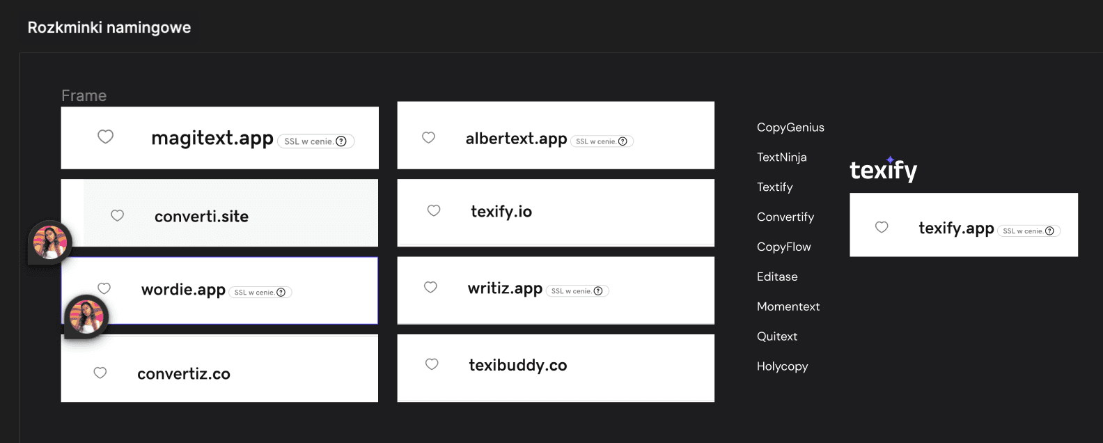
Despite my efforts during the naming process, Krzychu’s original idea,
Magic Text, was the best fit 👗
polished UI ✨

To my relief, during the UX review of the first coded version,
Krzychu didn’t need to make many corrections.

To my relief, during the UX review of the first coded version, Krzychu didn’t need to make many corrections.

To my relief, during the UX review of the first coded version,
Krzychu didn’t need to make many corrections.

never ending process 🔁

🎉 Celebrating, but…

The next stage of the project is to verify, if:

  • users are satisfied with the tool ➡️ Hotjar feedback widget,

  • users are using it regularly ➡️ returning users on Google Analytics,

  • all features work properly ➡️ Hotjar session recordings.

When a designed solution comes to light and can be shown to friends and family makes someone's life easier.

If you work with text and need a tool like this, feel free to use MagicText (and become one of the users I’ll be tracking through Hotjar during monitoring 😏).

reflections 🤔

The most satisfying moment?

When a designed solution comes to light and
can be shown to friends and family makes someone's life easier.

If you work with text and need a tool like this, feel free to use MagicText (and become
one of the users I’ll be tracking through Hotjar during monitoring 😏).

When a designed solution comes to light and can be shown to friends and family makes someone's life easier.

If you work with text and need a tool like this, feel free to use MagicText (and become one of the users I’ll be tracking through Hotjar during monitoring 😏).

My lessons learned:

  • Despite the extensive brief, where we have most of the information about the project,

    interview/kick-off with the client can be useful...


  • Using a ready-made wireframe kit greatly speeds up the work.

  • Making animations in Figma is fun 😍


  • Doing UX review of the coded product is essential!

My lessons learned:

  • Despite the extensive brief, where we have most of the information about the project, interview/kick-off with the client can be useful...


  • Using a ready-made wireframe kit greatly speeds up the work.

  • Making animations in Figma is fun 😍


  • Doing UX review of the coded product is essential!

My lessons learned:

  • Despite the extensive brief, where we have most of the information about the project,

    interview/kick-off with the client can be useful...


  • Using a ready-made wireframe kit greatly speeds up the work.

  • Making animations in Figma is fun 😍


  • Doing UX review of the coded product is essential!

do you like my
work?

let's collaborate and create amazing things 🌞

Framer template crafted with love by Dawid Pietrasiak & edited for portfolio purpose:) by Julia Wartacz

do you like
my work?

let's collaborate and create amazing
things 🌞

Framer template crafted with love by Dawid Pietrasiak

& edited for portfolio purpose:) by Julia Wartacz

do you like my work?

let's collaborate and create amazing things 🌞

Framer template crafted with love by Dawid Pietrasiak

& edited for portfolio purpose:) by Julia Wartacz