👩🏽💻 my role
UX Researcher
👩👩👦👦 team
me, PM, Unleash Team
me and
Developer (Krzychu)
⏰ time
3 (?) months
🏷 tags
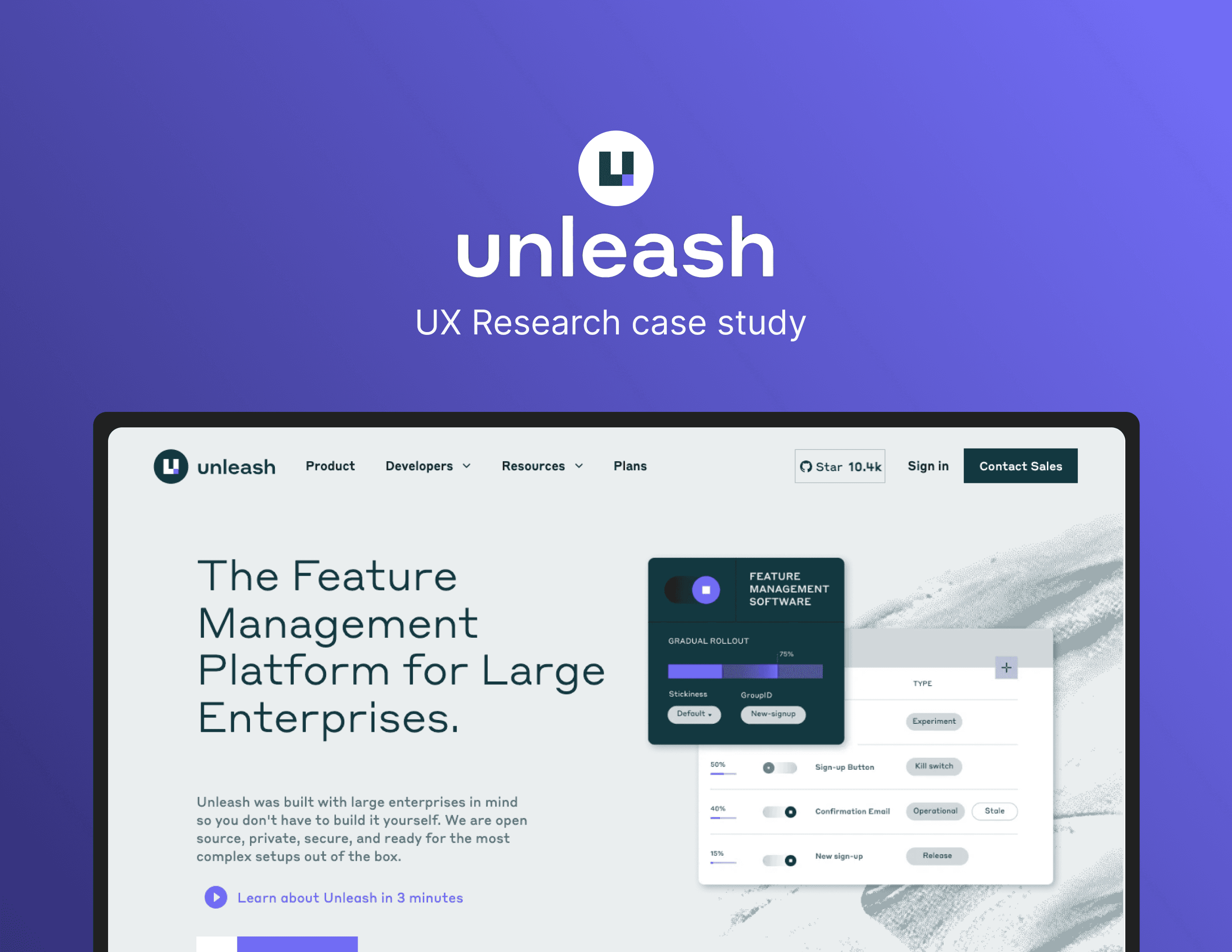
UX audit, website
convert text,
web application
so, what's the problem?
so, what's the problem?
so, what's the problem?
While working full-time at a creative agency, studying during weekends and trying to survive ☠️ I completed my first audit...
While working full-time at a creative agency, studying during weekends and trying to survive ☠️
I completed my first audit...
Quick story short, our agency was approached by a company that wasn't satisfied with the number of conversions on the Enterprise plan.
So we decided to help them with:
UX/UI audit,
surveys,
UX/UI consulting.
So we decided to help them with:
UX/UI audit,
surveys,
UX/UI consulting.
So we decided to help them with:
UX/UI audit,
surveys,
UX/UI consulting.
audit it with following steps...
audit it with following steps...
audit it with following steps...
Fortunately, I didn't have to figure out the process and steps to follow during the audit, as I received instructions from 25wat Product Design team.
Audit methodology 👩🏽🔬
Visual analysis
Checklist method
The cognitive walkthrough method
Usability audit - based on Jakob Nielsen's Heuristics
Responsiveness analysis (RWD) of the application
Analysis of the UI patterns used on the website
Google Analytics analysis
Hotjar session recordings and heatmaps analysis
Most important conclusions:
Pain points ❌
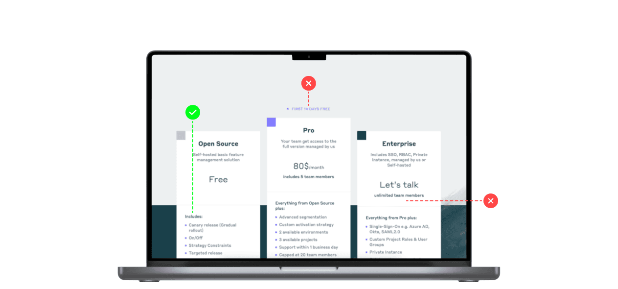
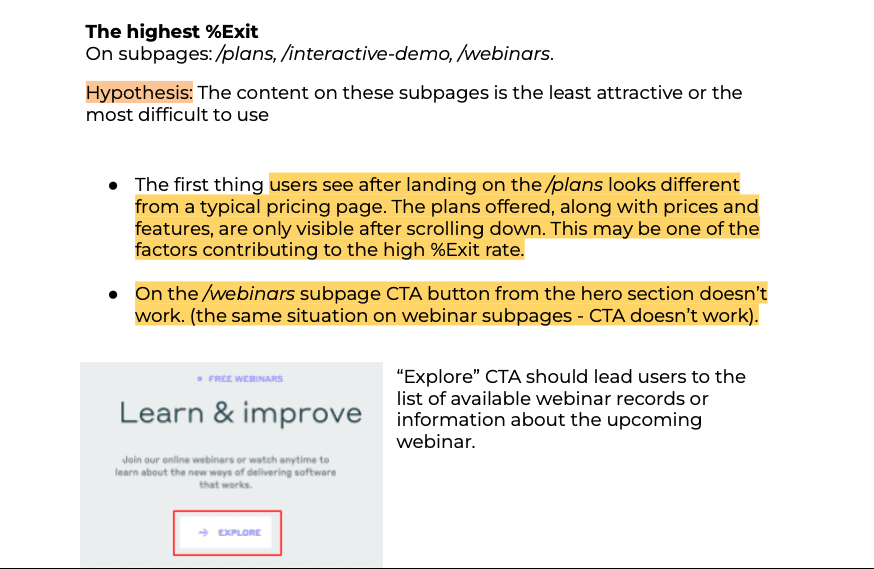
The plan tiles on the /plans subpage were hidden; users scrolled through the page to see them. Some users clicked “Plans” from the menu because they probably don’t know where they are.
The “Get started” button from the “Free plan” tile taked users to the GitHub website. It can distract users from other plans and their benefits.
/signup-enterprise subpage wasn't probably enough informative. Users had to return to /plans and read.
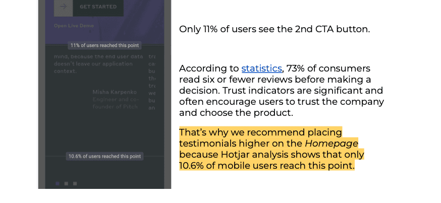
The main CTA button on /homepage weren't visible at first glance. Users scrolled down the page to see it. Hero text is overlapped by an image, making the site seem un-professional; some users try to click the image to remove it.
Hidden "close" icon on expanded mobile menu.
Lack of search.
Many elements on the site didn’t meet the WCAG 2.1 standards and don’t meet some of the Nielsen Heuristics.
Pain points ❌
The plan tiles on the /plans subpage were hidden; users scrolled through the page to see them. Some users clicked “Plans” from the menu because they probably don’t know where they are.
The “Get started” button from the “Free plan” tile taked users to the GitHub website. It can distract users from other plans and their benefits.
/signup-enterprise subpage wasn't probably enough informative. Users had to return to /plans and read.
The main CTA button on /homepage weren't visible at first glance. Users scrolled down the page to see it. Hero text is overlapped by an image, making the site seem un-professional; some users try to click the image to remove it.
Hidden "close" icon on expanded mobile menu.
Lack of search.
Many elements on the site didn’t meet the WCAG 2.1 standards and don’t meet some of the Nielsen Heuristics.
Solutions ✅
Rearranging /plans subpage layout to display the tiles higher.
Taking users to the “sign up for free” page and showing what they can achieve if they choose paid plans.
Placing more information about the plan on a dedicated subpage to encourage users and help them make a decision.
Once on the landing page, users should see the CTA button and the most important information to encourage them to perform the desired action.
The menu closing icon (on mobile) should be placed under the banner, or the banner shouldn’t be visible when the menu is expanded.
Including a search on the website to help users find the information they want.
Use greater text contrast on the website, minimum 44x44 px size for touch or mouse on buttons, use alt texts for images.
Most important conclusions:
Pain points ❌
The plan tiles on the /plans subpage were hidden; users scrolled through the page to see them. Some users clicked “Plans” from the menu because they probably don’t know where they are.
The “Get started” button from the “Free plan” tile taked users to the GitHub website. It can distract users from other plans and their benefits.
/signup-enterprise subpage wasn't probably enough informative. Users had to return to /plans and read.
The main CTA button on /homepage weren't visible at first glance. Users scrolled down the page to see it. Hero text is overlapped by an image, making the site seem un-professional; some users try to click the image to remove it.
Hidden "close" icon on expanded mobile menu.
Lack of search.
Many elements on the site didn’t meet the WCAG 2.1 standards and don’t meet some of the Nielsen Heuristics.
Solutions ✅
Rearranging /plans subpage layout to display the tiles higher.
Taking users to the “sign up for free” page and showing what they can achieve if they choose paid plans.
Placing more information about the plan on a dedicated subpage to encourage users and help them make a decision.
Once on the landing page, users should see the CTA button and the most important information to encourage them to perform the desired action.
The menu closing icon (on mobile) should be placed under the banner, or the banner shouldn’t be visible when the menu is expanded.
Including a search on the website to help users find the information they want.
Use greater text contrast on the website, minimum 44x44 px size for touch or mouse on buttons, use alt texts for images.
asking pays off
asking pays off
asking pays off
asking pays off
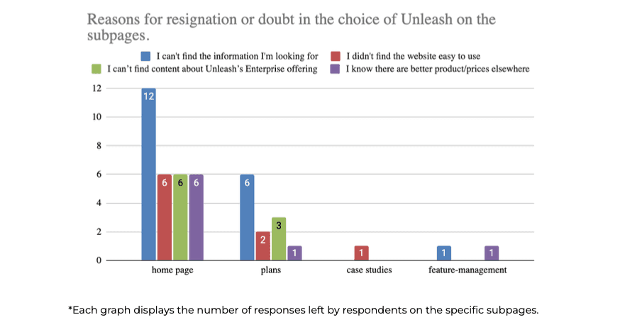
"The surveys aimed to determine why visitors leave the site.
We also wanted to determine whether users had concerns about the site's usability to eliminate users' pain points…"
Surveys were displayed to users on mobile and desktop devices.
We used elements of quantitative analysis to summarize the results of the surveys. 130 responses were recorded from both surveys combined.
Around 26% of respondents from countries such as Saudi Arabia, the US, Morocco, Romania, Belgium, and India answered off-topic, so their responses were unsuitable for further analysis.
"The surveys aimed to determine why visitors leave the site.
We also wanted to determine whether users had concerns about
the site's usability to eliminate users' pain points…"
Surveys were displayed to users on mobile and desktop devices.
We used elements of quantitative analysis to summarize the results of the surveys.
130 responses were recorded from both surveys combined.
Around 26% of respondents from countries such as Saudi Arabia, the US, Morocco,
Romania, Belgium, and India answered off-topic, so their responses were unsuitable for further analysis.
Surveys were displayed to users on mobile and desktop devices.
We used elements of quantitative analysis to summarize the results of the surveys. 130 responses were recorded from both surveys combined.
Around 26% of respondents from countries such as Saudi Arabia, the US, Morocco, Romania, Belgium, and India answered off-topic, so their responses were unsuitable for further analysis.
Most important recommendations ✅
Prioritizing Unleash's functionalities on the homepage.
Including information about the 14-day trial period of the Pro plan on the homepage,
Highlighting the benefits of choosing paid variants of the offer,
The /plans subpage needs to be revised in terms of the readability of the table comparing plans,
making the pricing and CTAs more visible.Create a FAQ section on the site that would include answers to questions
asked by survey respondents and customers during sales conversations.
Most important recommendations ✅
Prioritizing Unleash's functionalities on the homepage.
Including information about the 14-day trial period of the Pro plan on the homepage,
Highlighting the benefits of choosing paid variants of the offer,
The /plans subpage needs to be revised in terms of the readability of the table comparing plans, making the pricing and CTAs more visible.
Create a FAQ section on the site that would include answers to questions
asked by survey respondents and customers during sales conversations.
Most important recommendations ✅
Prioritizing Unleash's functionalities on the homepage.
Including information about the 14-day trial period of the Pro plan on the homepage,
Highlighting the benefits of choosing paid variants of the offer,
The /plans subpage needs to be revised in terms of the readability of the table comparing plans,
making the pricing and CTAs more visible.Create a FAQ section on the site that would include answers to questions
asked by survey respondents and customers during sales conversations.
Most important recommendations ✅
Prioritizing Unleash's functionalities on the homepage.
Including information about the 14-day trial period of the Pro plan on the homepage,
Highlighting the benefits of choosing paid variants of the offer,
The /plans subpage needs to be revised in terms of the readability of the table comparing plans, making the pricing and CTAs more visible.
Create a FAQ section on the site that would include answers to questions
asked by survey respondents and customers during sales conversations.
"The surveys aimed to determine why visitors leave the site. We also wanted to determine whether users had concerns about the site's usability to eliminate users' pain points…"
"The surveys aimed to determine why visitors leave the site. We also wanted to determine whether users had concerns about the site's usability to eliminate users' pain points…"
Rome wasn't built in a day ☝🏽
Rome wasn't built in a day ☝🏽
Rome wasn't built in a day ☝🏽
Rome wasn't built in a day ☝🏽

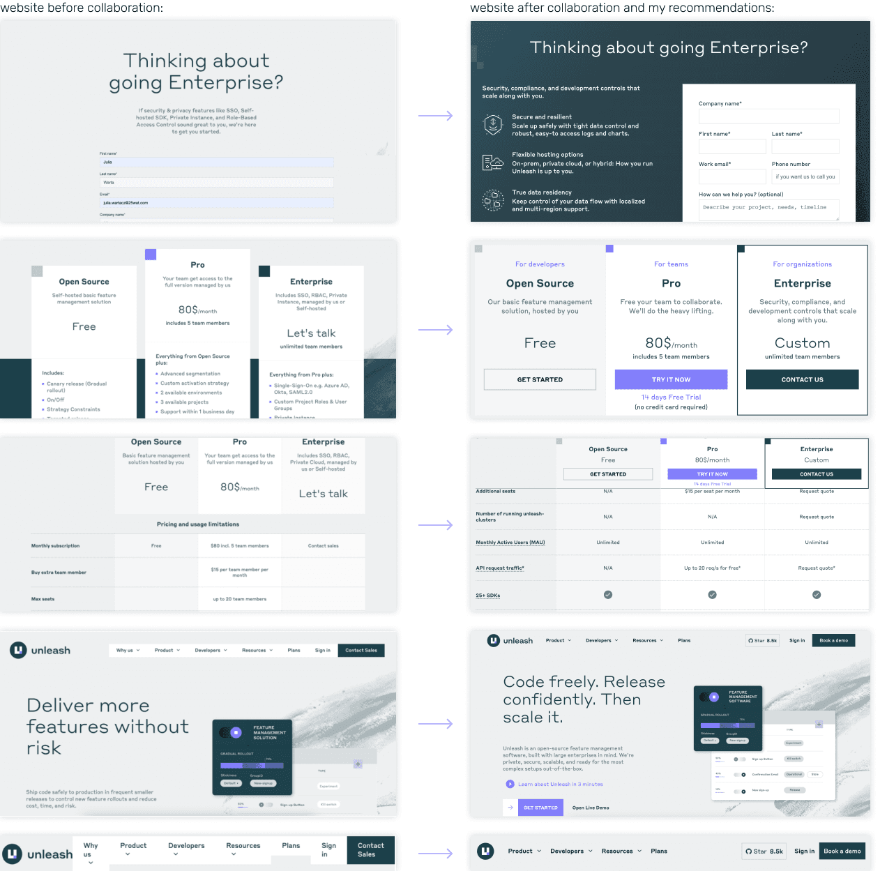
After sending recommendations, I participated in Unleash sprints
as a consultant for few months.
I made sure that the most important points from the analysis were not overlooked,
and Unleash's Designer included them in the redesign of the site.
After sending recommendations, I participated in Unleash sprints
as a consultant for few months.
I made sure that the most important points from the analysis were not overlooked, and Unleash's Designer included them in the redesign of the site.
After sending recommendations, I participated in Unleash sprints
as a consultant for few months.
I made sure that the most important points from the analysis were not overlooked, and Unleash's Designer included them in the redesign of the site.
polished UI ✨
polished UI ✨
polished UI ✨
polished UI ✨
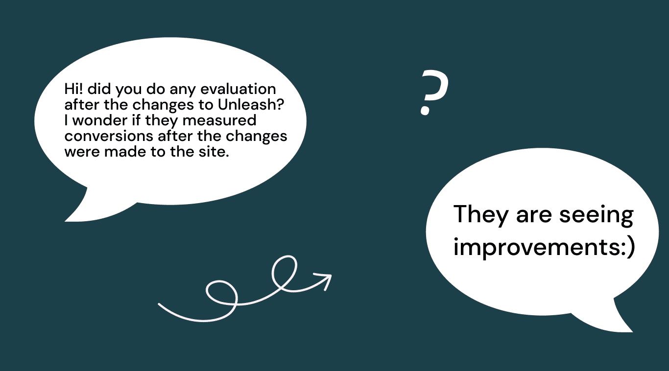
A few months later, I asked my ex PM…
reflections 🤔
reflections 🤔
reflections 🤔
reflections 🤔


Thrown into the deep water of data, I found…
little stress and enjoyment 😅 My first audit was very complex and I had a few hard moments…
But! after all, it was a very cool and necessary experience, because after that,
every subsequent audit performed for my clients was easier and more enjoyable.
My first audit was very complex and I had mini panic attacks a few times during this task 🙃
But after all, it was a very cool and necessary experience, because after that, every subsequent audit performed for my clients was easier and more enjoyable.
My first audit was very complex and I had mini panic attacks a few times during this task 🙃
But after all, it was a very cool and necessary experience, because after that, every subsequent audit performed for my clients was easier and more enjoyable.
My lessons learned:
Discovering through articles and conversations with colleagues the components necessary to reach specific conversion paths on the website.
Conducting a usability audit according to Nielsen Heuristics, and a cognitive walkthrough.
Analyzing heatmaps and session recordings in Hotjar.
Creating and analyzing surveys in Hotjar.
Defending design decisions supported by research during meetings with an external team.
explore more projects

do you like my
work?
let's collaborate and create amazing things 🌞
do you like
my work?
let's collaborate and create amazing
things 🌞
do you like my
work?
let's collaborate and create amazing things 🌞