👩🏽💻 moja rola
Badaczka UX
👩👩👦👦 zespół
ja, PM, zespół Unleash
⏰ czas
3 (?) miesiące
🏷 tags
UX audit, website
convert text,
web application
a więc... jaki mamy problem?
a więc... jaki mamy problem?
a więc... jaki mamy problem?
Podczas dla pracy w agencji kreatywnej, nauki w weekendy i prób przyżycia ☠️ ukończyłam swój pierwszy audyt...
Do naszej agencji zgłosiła się firma, która nie była zadowolona z liczby konwersji planu Enterprise.
Tak więc postanowiliśmy im pomóc:
audytem UX/UI,
badaniami,
doradztwem UX/UI.
Tak więc postanowiliśmy im pomóc:
audytem UX/UI,
badaniami,
doradztwem UX/UI.
So we decided to help them with:
UX/UI audit,
surveys,
UX/UI consulting.
zrób audyt w ten sposób...
zrób audyt w ten sposób...
zrób audyt w ten sposób...
Na szczęście nie musiałam samodzielnie opracowywać procesu i kroków do wykonania podczas audytu, ponieważ otrzymałam instrukcje od zespołu 25wat Product Design.
Metodologia audytu 👩🏽🔬
Visual analysis
Checklist method
The cognitive walkthrough method
Usability audit - based on Jakob Nielsen's Heuristics
Responsiveness analysis (RWD) of the application
Analysis of the UI patterns used on the website
Google Analytics analysis
Hotjar session recordings and heatmaps analysis
Najważniejsze wnioski:
Pain points ❌
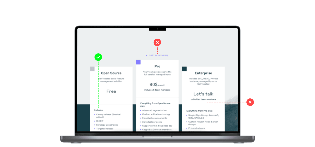
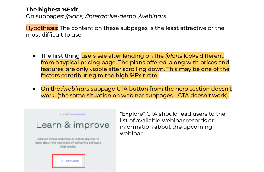
The plan tiles on the /plans subpage were hidden; users scrolled through the page to see them. Some users clicked “Plans” from the menu because they probably don’t know where they are.
The “Get started” button from the “Free plan” tile taked users to the GitHub website. It can distract users from other plans and their benefits.
/signup-enterprise subpage wasn't probably enough informative. Users had to return to /plans and read.
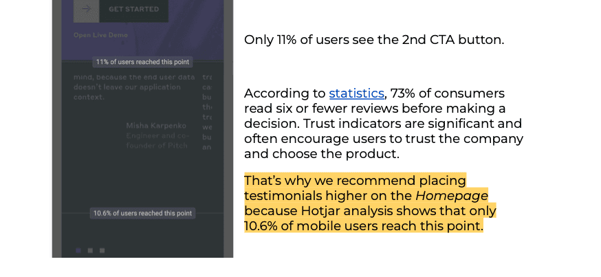
The main CTA button on /homepage weren't visible at first glance. Users scrolled down the page to see it. Hero text is overlapped by an image, making the site seem un-professional; some users try to click the image to remove it.
Hidden "close" icon on expanded mobile menu.
Lack of search.
Many elements on the site didn’t meet the WCAG 2.1 standards and don’t meet some of the Nielsen Heuristics.
Solutions ✅
Rearranging /plans subpage layout to display the tiles higher.
Taking users to the “sign up for free” page and showing what they can achieve if they choose paid plans.
Placing more information about the plan on a dedicated subpage to encourage users and help them make a decision.
Once on the landing page, users should see the CTA button and the most important information to encourage them to perform the desired action.
The menu closing icon (on mobile) should be placed under the banner, or the banner shouldn’t be visible when the menu is expanded.
Including a search on the website to help users find the information they want.
Use greater text contrast on the website, minimum 44x44 px size for touch or mouse on buttons, use alt texts for images.
Najważniejsze wnioski:
Pain points ❌
The plan tiles on the /plans subpage were hidden; users scrolled through the page to see them. Some users clicked “Plans” from the menu because they probably don’t know where they are.
The “Get started” button from the “Free plan” tile taked users to the GitHub website. It can distract users from other plans and their benefits.
/signup-enterprise subpage wasn't probably enough informative. Users had to return to /plans and read.
The main CTA button on /homepage weren't visible at first glance. Users scrolled down the page to see it. Hero text is overlapped by an image, making the site seem un-professional; some users try to click the image to remove it.
Hidden "close" icon on expanded mobile menu.
Lack of search.
Many elements on the site didn’t meet the WCAG 2.1 standards and don’t meet some of the Nielsen Heuristics.
Solutions ✅
Rearranging /plans subpage layout to display the tiles higher.
Taking users to the “sign up for free” page and showing what they can achieve if they choose paid plans.
Placing more information about the plan on a dedicated subpage to encourage users and help them make a decision.
Once on the landing page, users should see the CTA button and the most important information to encourage them to perform the desired action.
The menu closing icon (on mobile) should be placed under the banner, or the banner shouldn’t be visible when the menu is expanded.
Including a search on the website to help users find the information they want.
Use greater text contrast on the website, minimum 44x44 px size for touch or mouse on buttons, use alt texts for images.
pytania się opłaciły
pytania się opłaciły
pytania się opłaciły
pytania się opłaciły
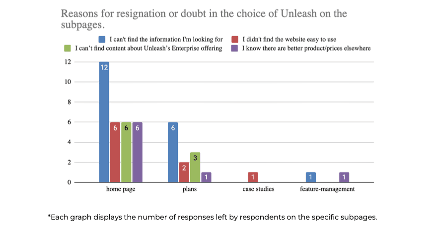
"The surveys aimed to determine why visitors leave the site.
We also wanted to determine whether users had concerns about the site's usability to eliminate users' pain points…"
Surveys were displayed to users on mobile and desktop devices.
We used elements of quantitative analysis to summarize the results of the surveys. 130 responses were recorded from both surveys combined.
Around 26% of respondents from countries such as Saudi Arabia, the US, Morocco, Romania, Belgium, and India answered off-topic, so their responses were unsuitable for further analysis.
"The surveys aimed to determine why visitors leave the site.
We also wanted to determine whether users had concerns about
the site's usability to eliminate users' pain points…"
Surveys were displayed to users on mobile and desktop devices.
We used elements of quantitative analysis to summarize the results of the surveys.
130 responses were recorded from both surveys combined.
Around 26% of respondents from countries such as Saudi Arabia, the US, Morocco,
Romania, Belgium, and India answered off-topic, so their responses were unsuitable for further analysis.
Surveys were displayed to users on mobile and desktop devices.
We used elements of quantitative analysis to summarize the results of the surveys. 130 responses were recorded from both surveys combined.
Around 26% of respondents from countries such as Saudi Arabia, the US, Morocco, Romania, Belgium, and India answered off-topic, so their responses were unsuitable for further analysis.
Most important recommendations ✅
Prioritizing Unleash's functionalities on the homepage.
Including information about the 14-day trial period of the Pro plan on the homepage,
Highlighting the benefits of choosing paid variants of the offer,
The /plans subpage needs to be revised in terms of the readability of the table comparing plans,
making the pricing and CTAs more visible.Create a FAQ section on the site that would include answers to questions
asked by survey respondents and customers during sales conversations.
Most important recommendations ✅
Prioritizing Unleash's functionalities on the homepage.
Including information about the 14-day trial period of the Pro plan on the homepage,
Highlighting the benefits of choosing paid variants of the offer,
The /plans subpage needs to be revised in terms of the readability of the table comparing plans, making the pricing and CTAs more visible.
Create a FAQ section on the site that would include answers to questions
asked by survey respondents and customers during sales conversations.
Most important recommendations ✅
Prioritizing Unleash's functionalities on the homepage.
Including information about the 14-day trial period of the Pro plan on the homepage,
Highlighting the benefits of choosing paid variants of the offer,
The /plans subpage needs to be revised in terms of the readability of the table comparing plans,
making the pricing and CTAs more visible.Create a FAQ section on the site that would include answers to questions
asked by survey respondents and customers during sales conversations.
Most important recommendations ✅
Prioritizing Unleash's functionalities on the homepage.
Including information about the 14-day trial period of the Pro plan on the homepage,
Highlighting the benefits of choosing paid variants of the offer,
The /plans subpage needs to be revised in terms of the readability of the table comparing plans, making the pricing and CTAs more visible.
Create a FAQ section on the site that would include answers to questions
asked by survey respondents and customers during sales conversations.
"The surveys aimed to determine why visitors leave the site. We also wanted to determine whether users had concerns about the site's usability to eliminate users' pain points…"
"The surveys aimed to determine why visitors leave the site. We also wanted to determine whether users had concerns about the site's usability to eliminate users' pain points…"
nie od razu Rzym zbudowano ☝🏽
nie od razu Rzym zbudowano ☝🏽
nie od razu Rzym zbudowano ☝🏽
nie od razu Rzym zbudowano ☝🏽

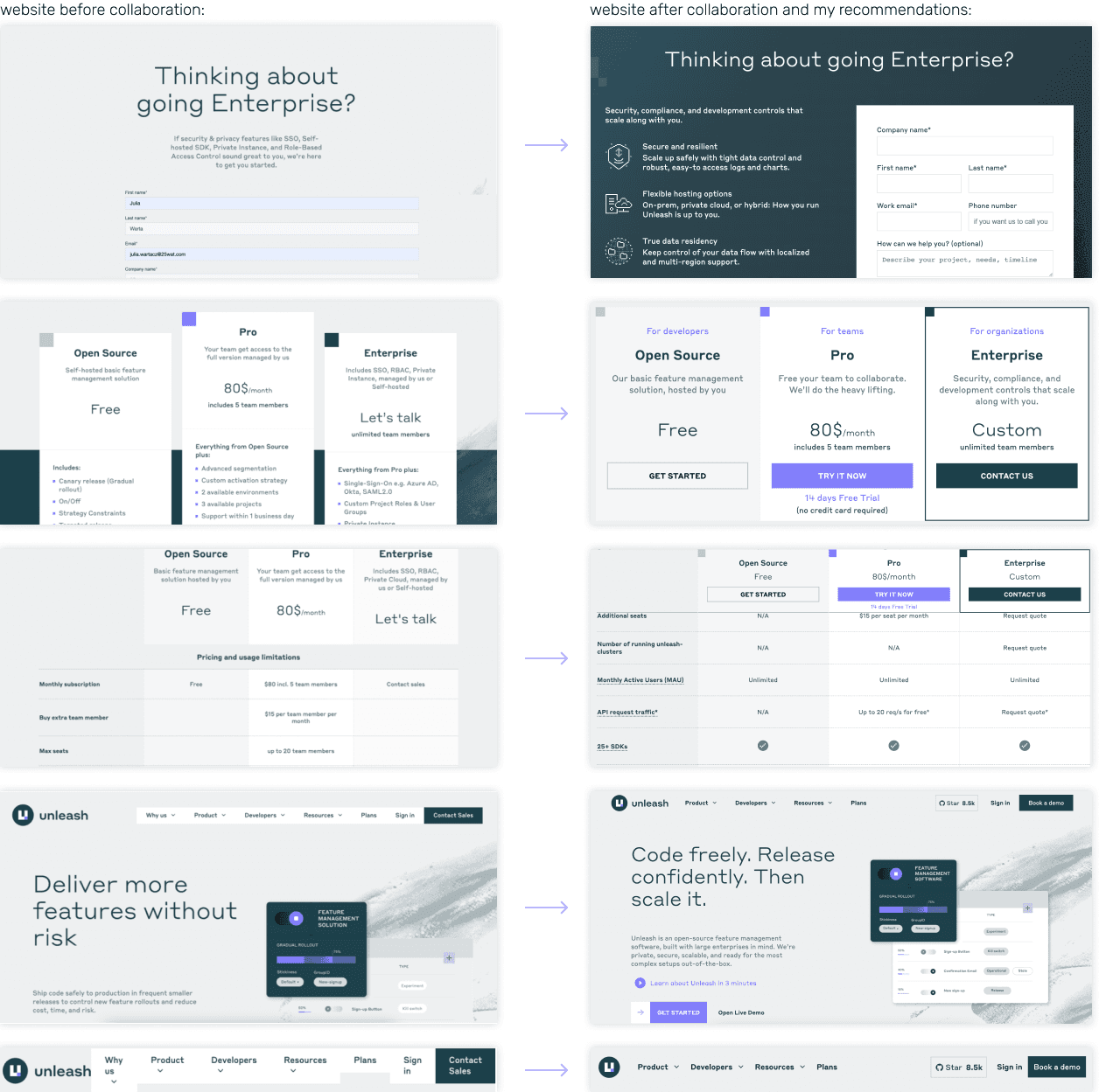
After sending recommendations, I participated in Unleash sprints
as a consultant for few months.
I made sure that the most important points from the analysis were not overlooked,
and Unleash's Designer included them in the redesign of the site.
After sending recommendations, I participated in Unleash sprints
as a consultant for few months.
I made sure that the most important points from the analysis were not overlooked, and Unleash's Designer included them in the redesign of the site.
After sending recommendations, I participated in Unleash sprints
as a consultant for few months.
I made sure that the most important points from the analysis were not overlooked, and Unleash's Designer included them in the redesign of the site.
doszlifowane UI ✨
doszlifowane UI ✨
doszlifowane UI ✨
doszlifowane UI ✨
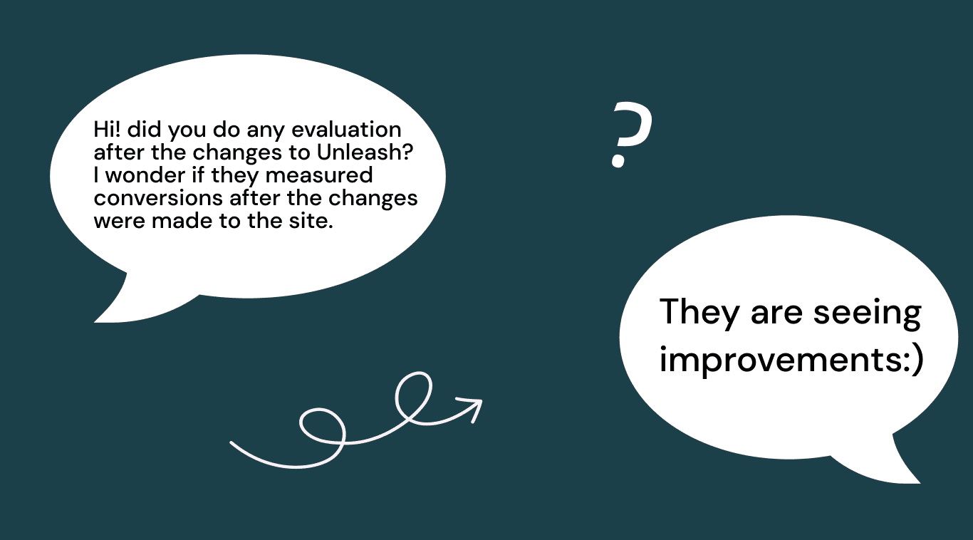
Kilka miesięcy później zapytałam mojego byłego PM…
przemyślenia 🤔
przemyślenia 🤔
przemyślenia 🤔
przemyślenia 🤔



Rzucona w głębiny danych, odnalazłam…
trochę stresu i dużo radości 😅 Mój pierwszy audyt był dość skomplikowany i miałam kilka cięższych momentów...
Ale! Mimo wszystko było to bardzo fajne i potrzebne doświadczenie, ponieważ po tym, każdy kolejny audyt wykonywany dla moich klientów był łatwiejszy i przyjemniejszy.
trochę stresu i dużo radości 😅 Mój pierwszy audyt był dość skomplikowany i miałam kilka cięższych momentów...
Ale! Mimo wszystko było to bardzo fajne i potrzebne doświadczenie, ponieważ po tym, każdy kolejny audyt wykonywany dla moich klientów był łatwiejszy i przyjemniejszy.
My lessons learned:
Discovering through articles and conversations with colleagues the components necessary to reach specific conversion paths on the website.
Conducting a usability audit according to Nielsen Heuristics, and a cognitive walkthrough.
Analyzing heatmaps and session recordings in Hotjar.
Creating and analyzing surveys in Hotjar.
Defending design decisions supported by research during meetings with an external team.
zobacz więcej projektów

do you like my
work?
let's collaborate and create amazing things 🌞

do you like
my work?
let's collaborate and create amazing
things 🌞

do you like my
work?
let's collaborate and create amazing things 🌞
